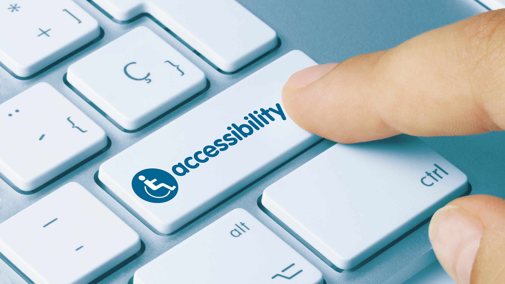
With accessibility deadlines for state and local government websites in 2026 and 2027 approaching, we’re sharing some key accessibility best practices we’ve learned working with school district and county government clients.
Over the last few years, we’ve worked with the Department of Education and a couple of our school district clients on ensuring their websites meet the Department’s accessibility standards. While our sites have always been built with accessibility in mind, the experience emphasized core functionality that can be missed with automated accessibility checks.
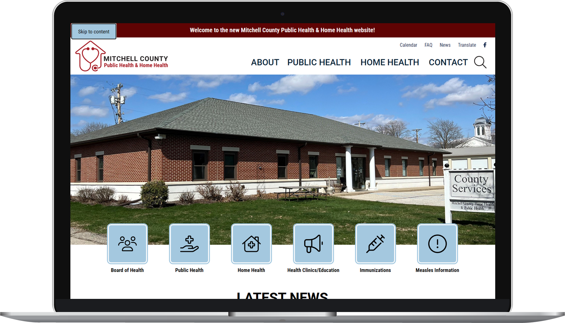
A “Skip to Content” button in the navigation of one of our latest site launches helps users using only a keyboard, skip having to tab through navigation on every site page.
Now, we strive to include key accessibility features in all of our site buildouts, and we’re also working with some of our county government clients to ensure their websites are fully accessible in the lead-up to the 2026 and 2027 website accessibility compliance deadlines set by the U.S. Department of Justice. Just like with our education clients, all of our accessibility updates start with a site review.
We begin by manually checking all core pages of the site, documenting issues, and then making the necessary updates. Some of our clients have opted into a new accessibility maintenance plan with us to ensure that their site stays accessible while remaining flexible so staff can continue to add fresh content. These site updates and reviews have given us a lot of insight into accessibility best practices, and we’re excited to share some of our findings.
“Website accessibility is not always intuitive. We're thankful for all of the discoveries we made working with the Department of Education, and it has been rewarding to implement these practices for our clients and to offer enhanced accessibility and maintenance packages.”
Brian McMillinPresident, Neapolitan Labs
Keyboard Only
Some website visitors may be navigating the internet using only a keyboard and no mouse. In these cases, they use the tab key to navigate from each interactive element on a website page. This can be tricky if a site isn’t built for this functionality as the user may not have access to navigation dropdowns, toggled content, and other similar elements. Try to navigate your site using only a keyboard. Is it doable or are there pain points?
Screen Readers
Visitors to your website could be utilizing screen readers to access your content. Certain formatting can make this process confusing or downright frustrating. PDFs in particular may not be accessible at all if a user is attempting to use a screen reader to access a PDF that consists of an image or a scan.
PDFs
PDFs are a special accessibility beast. The best advice we can give? Avoid them as much as possible in favor of a more user-friendly option. Ask yourself, does this need to be a PDF? Can the content be inserted into a page on your site? If so, that is likely the best option for all website users.
If a PDF must be used due to size, practicality, or for a printable option, do not use a scan. Screen readers cannot recognize text in an image. Use the original digital version (usually a Word Doc, Google Doc, or InDesign file) to create a PDF file. Research accessibility best practices for the program you’re using and follow them as you create documents for the smoothest experience.
To be fully accessible, once the document is saved as a PDF, use Adobe Acrobat’s Accessibility Check tool to ensure your document is ready for the web. Warning: The Accessibility Check process can be very involved and time-consuming, especially if a document is not created following best practices. That’s why we recommend doing everything possible to meet accessibility standards before getting to this point (i.e., moving content to a webpage or making the document accessible from the very start, in your program of choice).
Heading Structure
Headings are helpful to all site visitors, breaking content up into more easily digestible sections and helping users jump ahead to particularly relevant information. Visually, it may not appear to matter if you use bold text to stylize these headings or use H3 styling (without an H2 in sight), but for those using screen readers and hearing the heading type read aloud, utilizing proper heading structure is crucial for clarity. Proper heading structure should be:
- H1: Used one time for the page title
- H2: Used next for headings
- H3: Used for subheadings to H2
- And so on
If you only use bold or italic text, screen readers will not identify it as a heading, and if you jump ahead to H3 without using H2 or to H4 without using H3, that can cause confusion in the hierarchy of the sections and mislead the user into thinking a section is missing.
Bonus: Proper heading structure also makes your website content more readable to search engines — a win-win!
Alt Text
Alt text is another great example of an accessibility feature that also helps out your search engine optimization. Alt text helps those using screen readers understand what an image on your site is of. It can also help users with slow internet if a photo decides not to load. Adding alt text to all non-decorative, content-relevant images helps give all visitors to your website the ability to “view” the images you include. For tips on writing alt text, we love this alt text how-to blog post from HubSpot.
Ambiguous Links
When using a screenreader or only a keyboard to navigate website content, ambiguous links can make it tough for the user to understand where the link will take them. Ambiguous links often look like:
- Here
- Read more
- See all
- https://neapolitanlabs.com/contact/
- It’s best to avoid full URLs as these may not be read aloud by screen readers correctly or provide the most clarity on where the link will resolve.
If I’m using a keyboard to tab to the next interactive element on the page and I get to a link that says “Click here,” I may not have the context of the paragraph above it to understand where “Click here” is going to take me. Instead, it’s recommended to use the name of the site page/article or a call to action. For example, if we were linking to our website, we may want to use:
Instead of:
Use of Color
Color Contrast
It may seem obvious to be able to tell if text is readable on various background colors, but from experience, we can say it’s not always as clear as you’d think. That fresh, modern trend of white font? We love it, but, sadly, it oftentimes doesn’t pass a color contrast test on backgrounds we would have considered readable in the past. There are tools you can use to test if colors, text, and elements are passing contrast rules. We’ve been using WebAIM’s Contrast Checker with great results. The tool checks if two colors pass AA and AAA accessibility tests (including based on text size).
Color Coding
If someone has difficulty distinguishing between colors, it’s vital that they can navigate a site without relying on color alone as an indicator of links, interactive elements, or as a key to understanding content. For example, you won’t want to only have links distinguishable from other text on a site page by color. You’ll also want to have them underlined or bolded. That way, if someone can’t see the blue you selected, the secondary distinguishing element helps them know it’s different than the other text on the page.
Assistance with Accessibility
We couldn’t fit everything we learned into this blog post, but if you’d like to talk accessibility or have concerns about your site, we’d love to discuss further. Ask us about our full accessibility package and maintenance options.